Joey’s Backpack Co.
{Let’s jump into an adventure}

The Challenge
Joeys was founded on the idea that children are always learning and seeking out new adventures. Joeys provide kids with the most durable and affordable products, that allow them to explore and learn wherever they are.
The Approach
I developed the Joey’s brand from scratch, grounding it in playfulness, and adding that child-like attitude into everything: an evocative name, a cute mascot, and colorful products. Each interaction with the brand invites children to jump into an adventure.
Jack the Joey is a core component of the Joey’s brand as every child needs a pal when they go on an adventure no matter how big or small! Jack gives the brand a recognizable face and gives each backpack a personality.
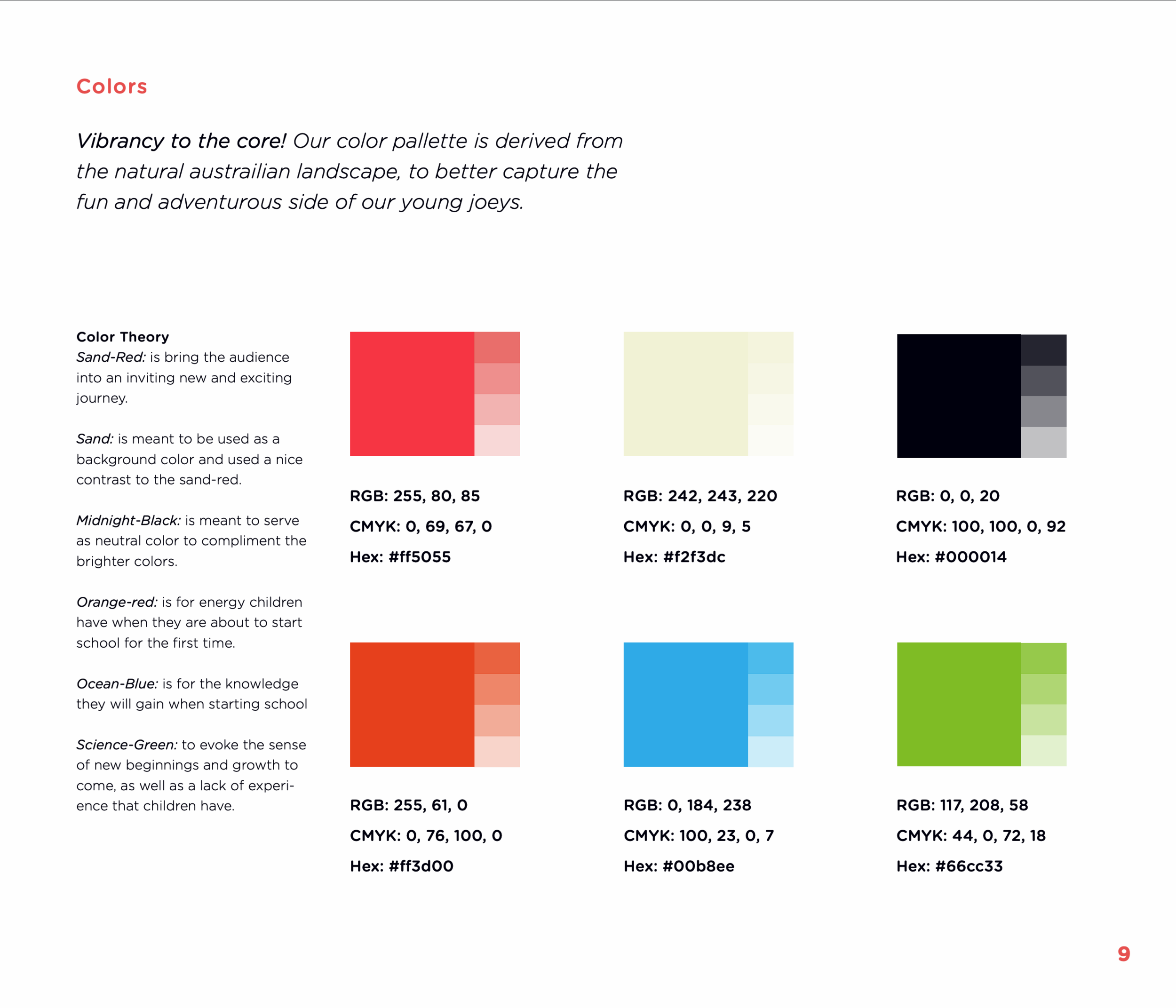
The Brand
Joeys took a lot of inspiration from the outback of Australia. Capturing the landscape from the shrubs and waterways along with the rusted sand throughout the landscape for its color theory .
The typography was more based on the light-heartedness of children’s handwriting with the use of Westfalia a simple hand-written typeface that provides a playfulness and child-like feeling with every letter. Gotham Rounded grounds the brand while still retaining a friendly aesthetic.


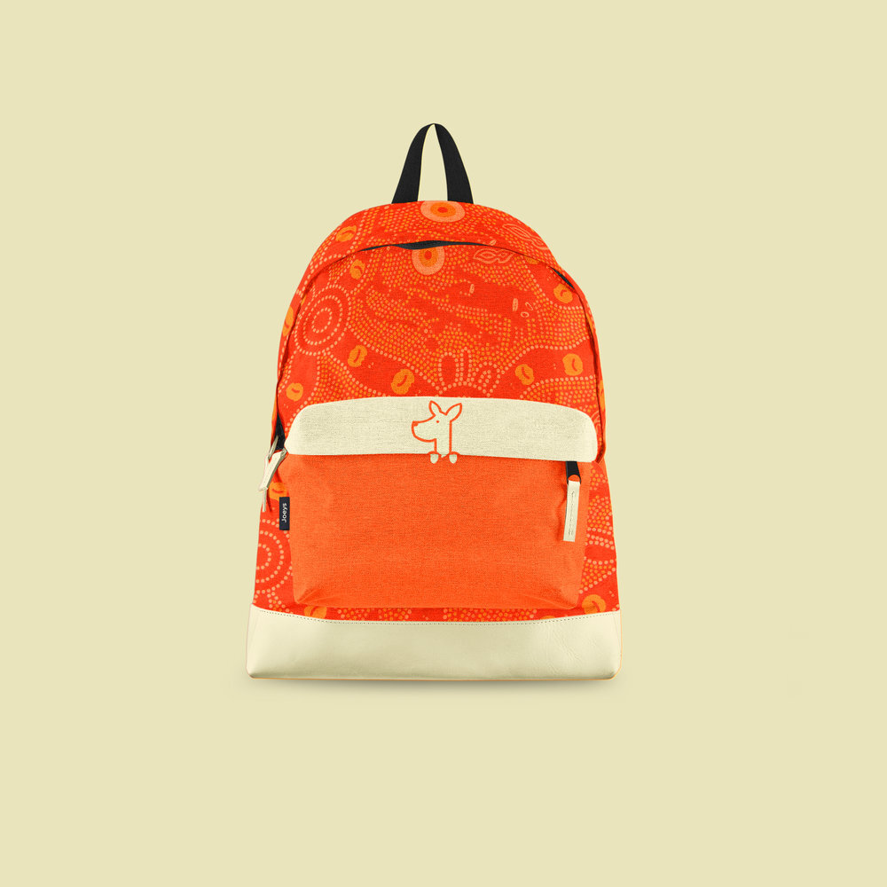
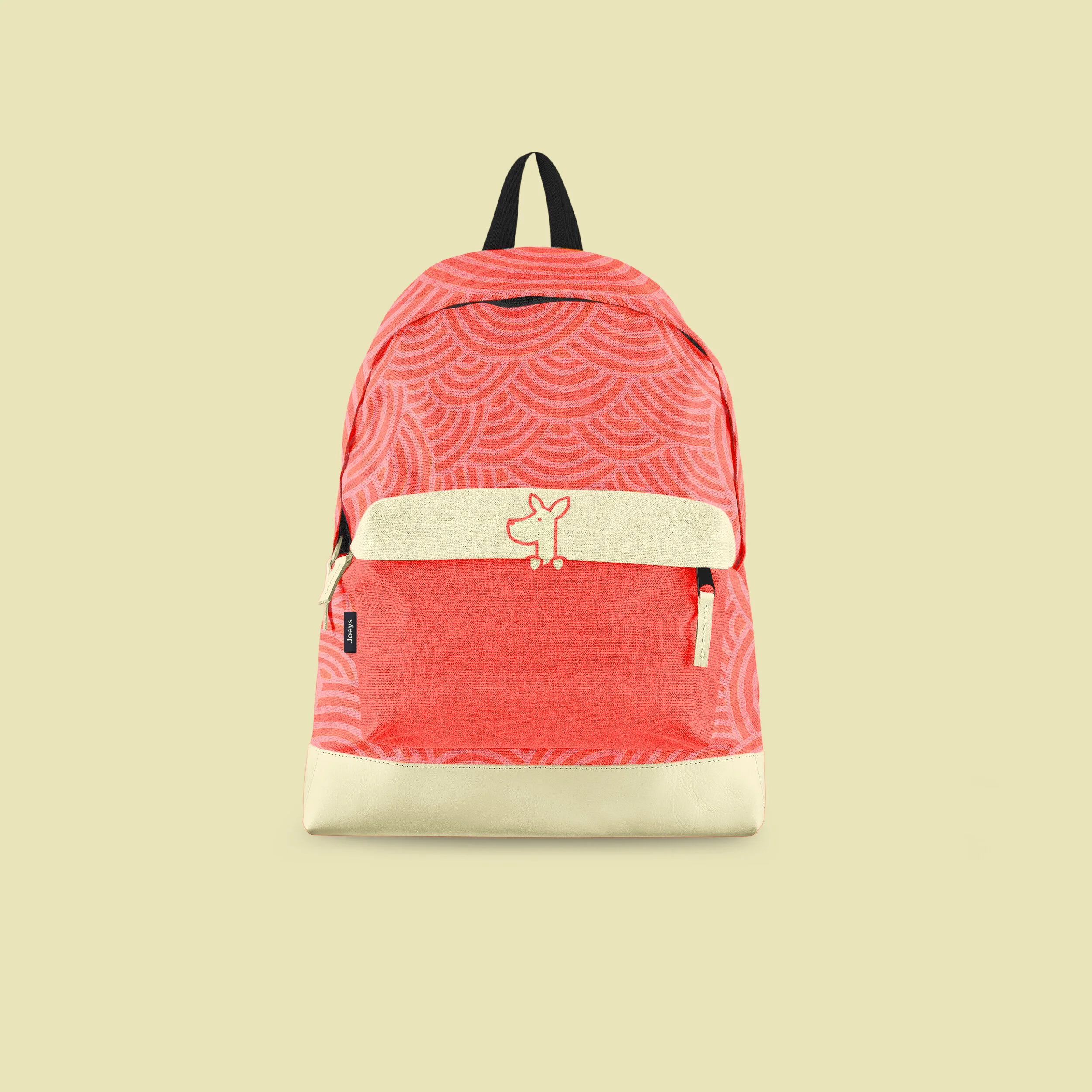
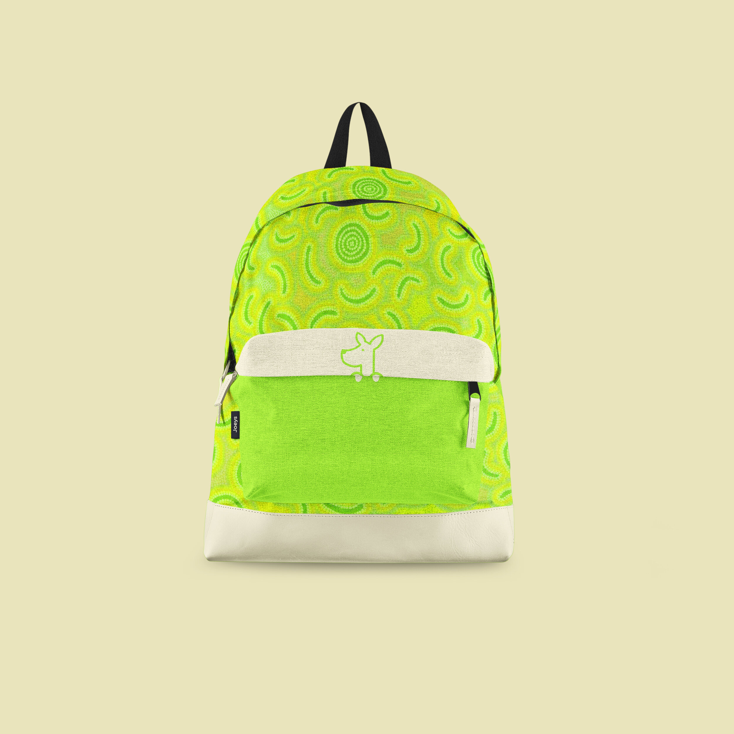
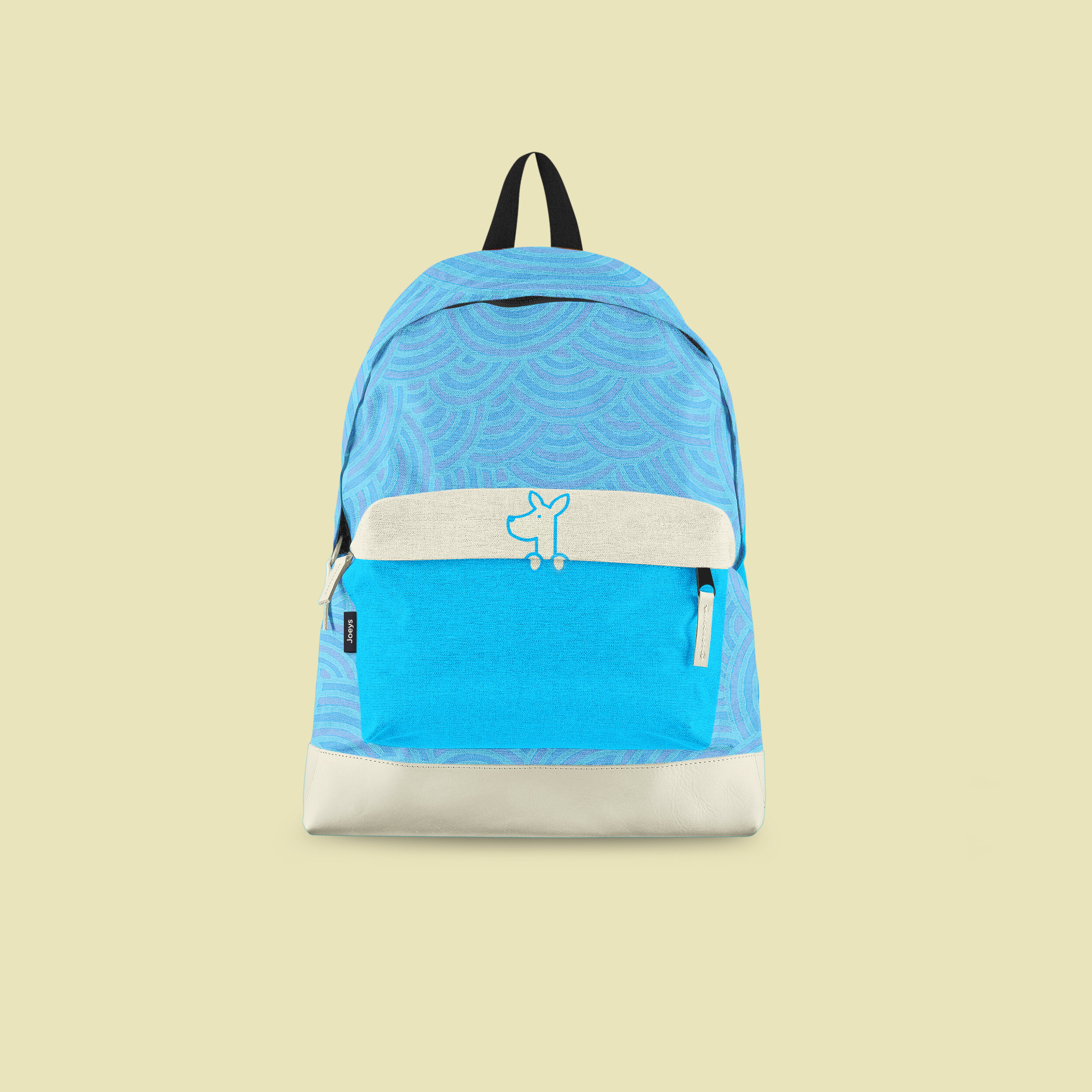
The Backpack
The Joeys Backpack comes in 4 distinct colors, each with their own Aborigine patterns and a bright color. The backpack design is very contemporary and has its own charm, giving each backpack its own little personality. Put this all together and you get one eye-catching backpack that’s sure to fly off the shelves.
Brand Extension
The brand highly places emphasis on Jack the Joey, this is done to ensure that the symbol becomes completely associated with the backpack and the brand. Below you’ll find more elements of the brand in action and how it scales from medium to medium.


The Takeaway
Designing Joeys Backpack Co. was fun, it got me to think a lot about how symbols can bring out an emotion from someone as well as the challenge of crafting a brand that honored the symbol and made its presence known where it went.