Populi
{Simple, Connected, Approachable}
The Challenge
This was an assignment to build Social CMS (Content Management System) Design in under a working day. The CMS has to revolve around 2 specific pages; a dashboard and a create new report page. The underlying goal was to see how fast I was at using design thinking to build out these pages.
The Approach
I decided that in order to make these two pages I would also need to create some guidelines for these pages, so that they have underlying theme behind it. I realized that rather than just designing just the two pages, there also needed to be an underlying brand narrative that would prop the pages. Thus Populi was born.

The brand story.
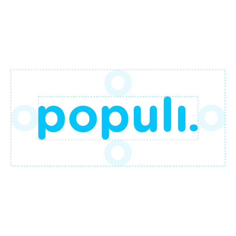
The name Populi was derived from populous and population. Since the CMS is about social media, and how many users are interacting with said social media, I thought the name suited that brand well as it was about people, was instantly understood, and is easy to pronounce.
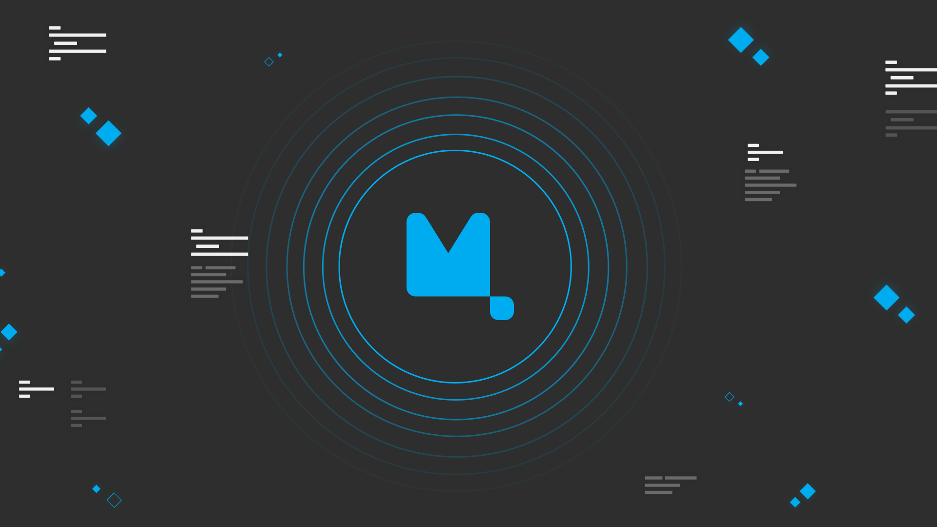
The design choices for Populi were set by the need to have a CMS platform that was super fast and connected. This affected everything from the logotype to the colors. The logo of Populi is meant to be approachable, simple, and connected. The logo uses a rounded typeface to convey approachability, the type is san-serif to convey simplicity, and the combination of the letters l, i, . are meant to convey connectedness for the brand.


Being Approachable
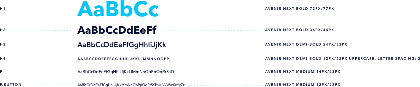
Populi’s system typeface because Avenir Next is an approachable san-serif typeface that is highly readable, and has a wide range of weights within the typeface. While the colors used are based on a blue that is social and friendly, everything is a deviation of that color to keep consistency.
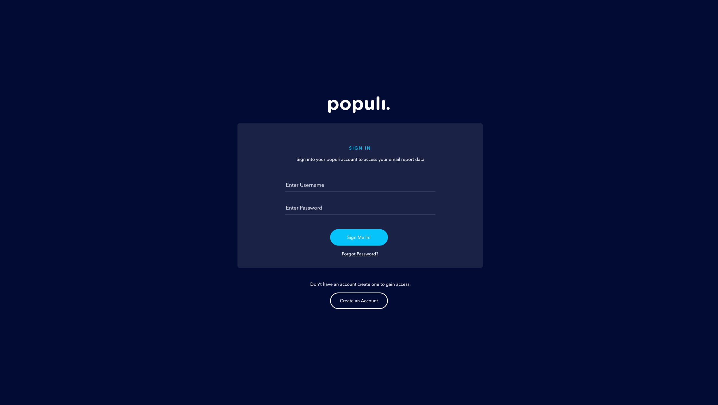
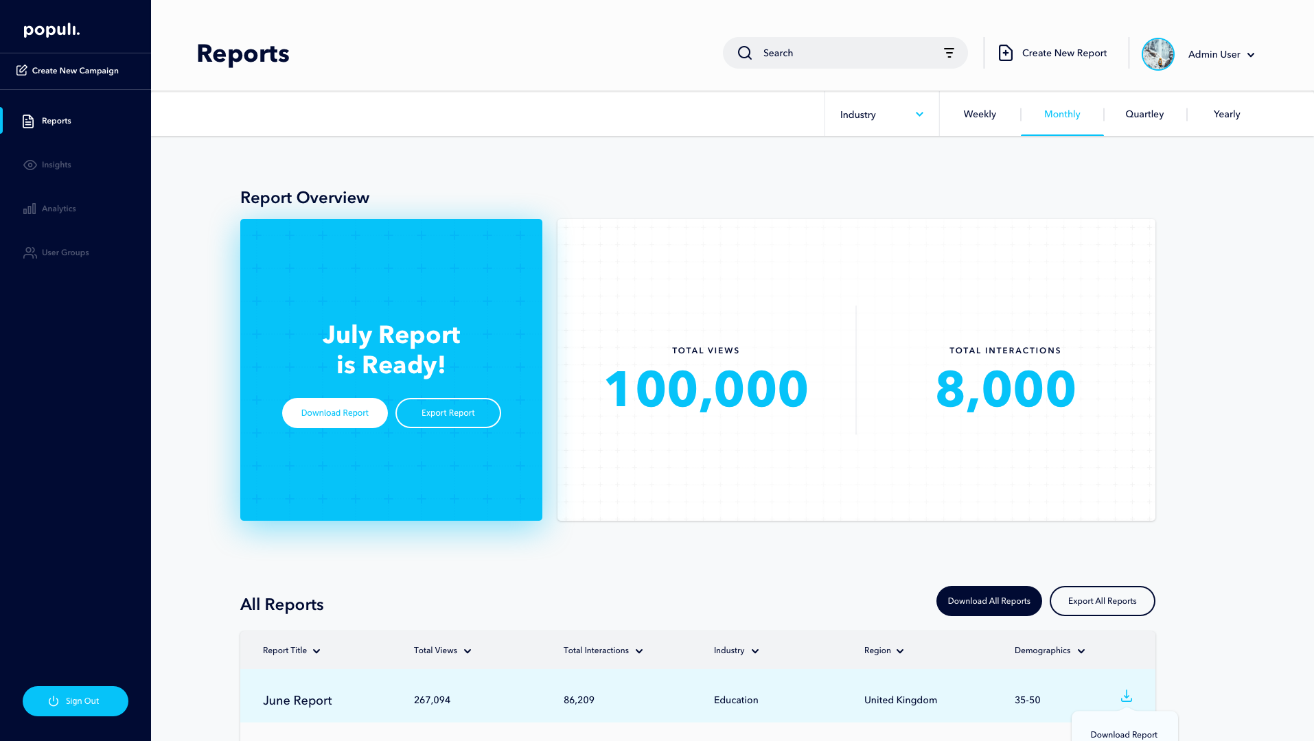
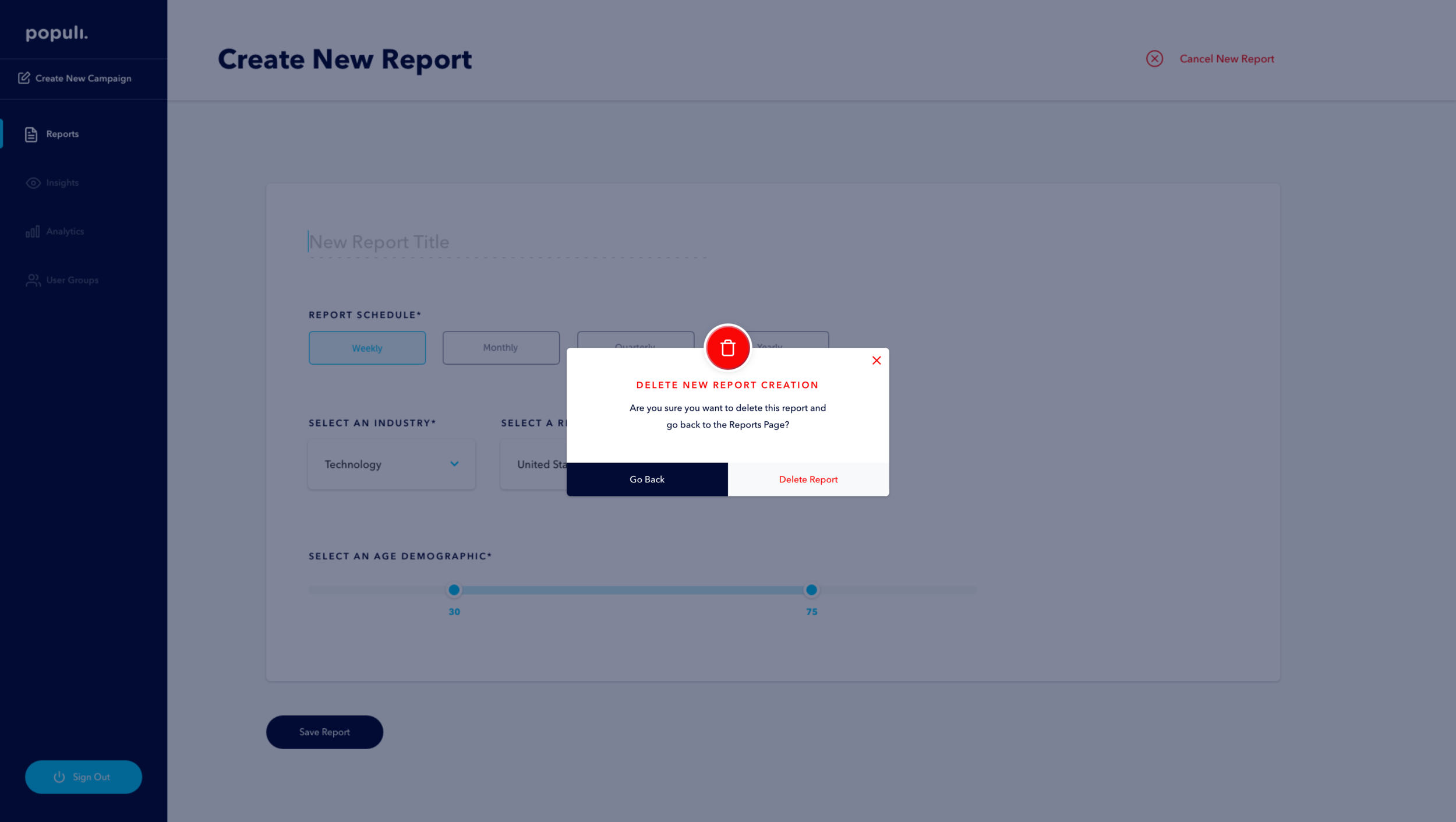
The color palette is made of up of the Populi blue, Populi Gray, Populi Black, and white. The color structure used in the Populi Brand had to be consistent across the brand as well. Using the Populi Blue to indicate selected states. While Populi Black has the highest saturation and therefore used to indicate CTAs and the most readable content on the site. We used Populi Gray as a background color, and Populi White as an inverse and as the card background throughout the UI.


A CMS that’s finally simple
For the experience of the CMS, I wanted to give clear areas of indications for where the User is supposed to interact with. While still having an approachable voice to the CMS. The goal of the interface was to allow the user to quickly get to where they need without needing to think too much.
“A much more interactive experience than other CMS s is more beneficial in the long run for the end user.”


Motion Design
With any kind of tool used to manage content, the transitions between screens and the how fast things load and do things becomes very important. The motion design for Populi kept this in mind and focused on 3 keywords: Functional, Efficient, and Simple. The motion is fast and powerful allowing the user to get the feeling that it is a fast, fluid, continuous movement throughout the whole interface. Whether its a dialog box popping up or delightful little illustration everything uses the same motion curves to give it a similar feel throughout the interface.
The Result
Populi is a CMS with purpose from the ground up. Rather than just being something merely for data collection, Populi allows the user to have functional, efficient, and simple experience with the product. Populi shows the value of building out a full brand architecture that carries throughout the product and something that could live outside of the product.
Key Takeaways
Since Populi was a 2-day sprint, understanding how fast it takes to develop a brand that elevates an interface to be one cohesive piece, this was really valuable. It showed me the power of how just thinking through the impact of color, and type in an interface.