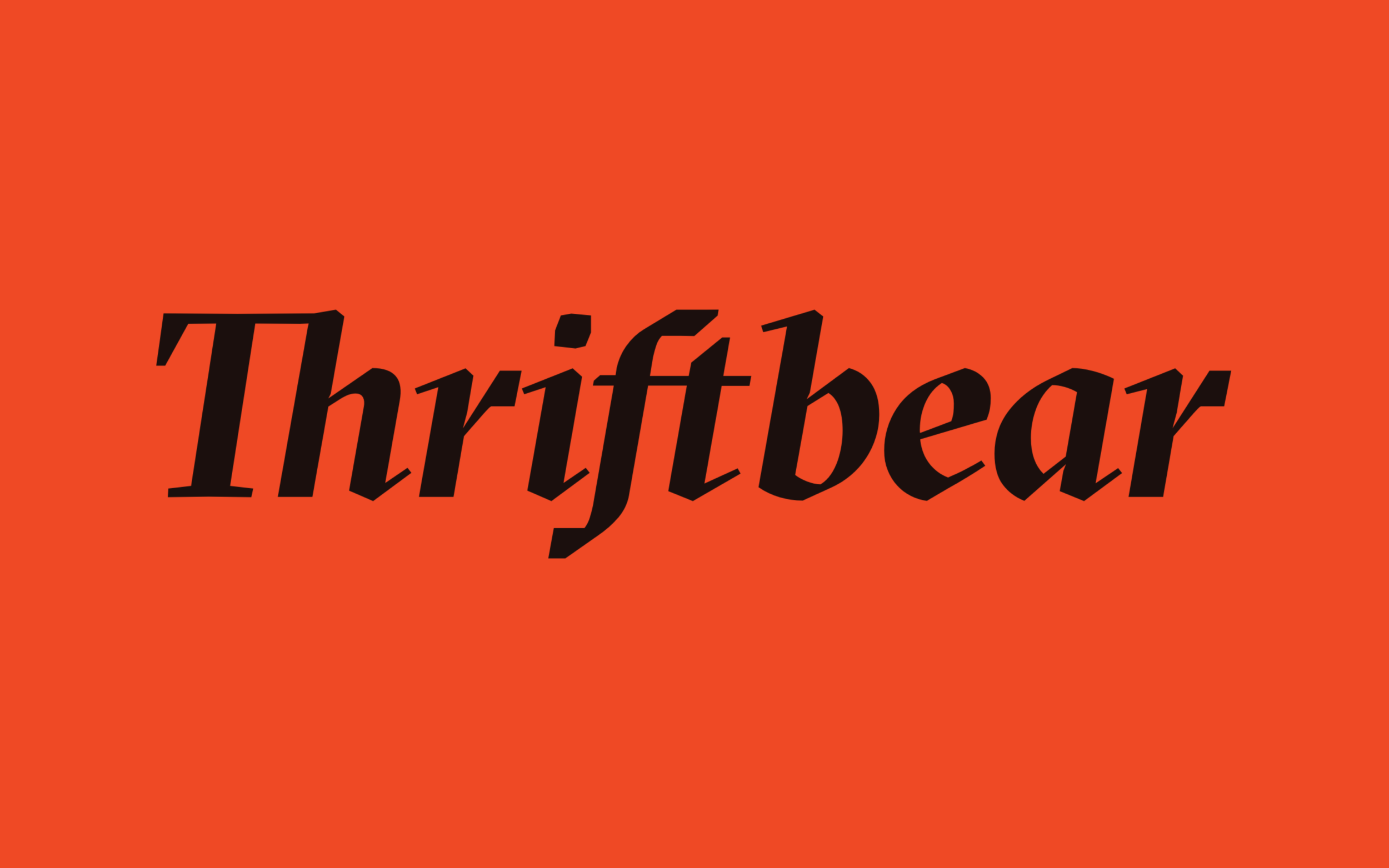
Thriftbear
{Turning stories into stores}

The Challenge
Today people shop more environmentally conscious than ever before. They want to make sure that they aren’t leaving a bigger carbon footprint than previous generations. Because of this many local thrift stores have arisen in popularity. Thriftbear is a new company aimed at giving these independent stores online services and management.
The Approach
I developed the Thriftbear’s brand from scratch, grounding it in humanity, and infusing that feeling into everything: an evocative name, sturdy logotype, and an elegant digital experience.
Scribbles aren’t just for kids.
Anchoring Thriftbear’s design is its illustrations that adds to the brand’s human touch.
Illustrations by Joey Belardi

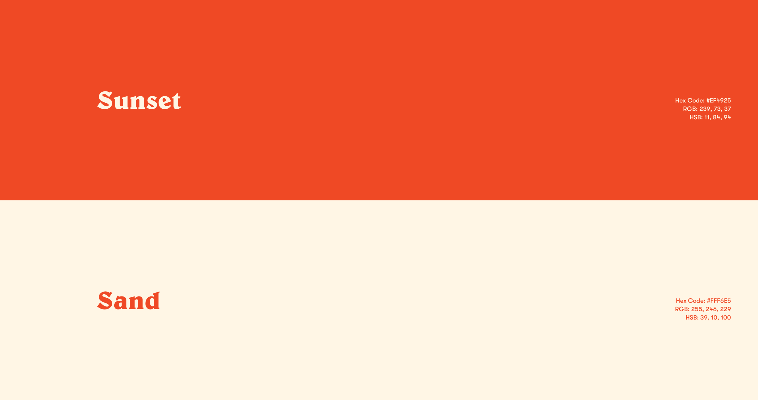
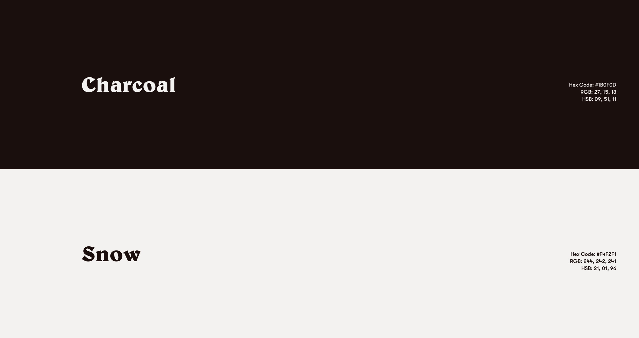
Color
The Thriftbear colors represent the outdoors, from the warmth of the fire to the leaves on trees. These are abstracted into Thriftbear’s core color palette: Warmth, Neutral, Natural

Typography
Thriftbear’s typography is just as diverse as its clientele. We use a total of 4 different typefaces in our brand to capture our client’s organic and fresh approach to shopping online.

Let’s See it in Action!


Key Takeaway
Thriftbear is an exciting company one that aims to truly bring people from the digital world back into the physical world. Crafting a brand that’s a movement