Big Shooter Productions
{Making every shot count}

The Challenge
Big Shooter Productions needed to re-energize their brand and culture dedicated to film. In a saturated, jargon-filled market, it was our first challenge to give this work-hard/play-hard team a stand-out brand makeover. But the real challenge came in redesigning and developing a fluid website that could communicate how much they love to make films for their clients — while capturing everything Big Shooter Productions offers.

The Approach
We kicked off brand strategy with an exercise with Big Shooter Productions to nail down brand essence. The result? A prescription for a brand that exudes authenticity and personality.
However, the visuals had a tall order: they needed to carry the boldness of production while feeling fun and fresh, to reflect Big Shooter Productions.
The key was structure. We started by taking the existing symbol and re-working it to simplify it and give it personality. We named the logo-mark “Tele” and designed a system to showcase the adaptability of the brand. We chose two typeface families, that’s bold and simple. The leading color, a burning orange, formed the core of the color palette.


The Command Line://_
The UI system for Big Shooter Productions is rooted in old computer interfaces from sci-films
This captured the spirit of Big Shooter Productions which was rooted in the idea of using new technologies while still retaining traditional film techniques. Thus formed the idea of Retro-future: A UI design style that was rooted in the design’s of interfaces from movies like 2001: A Space Odyssey.

The User Experience
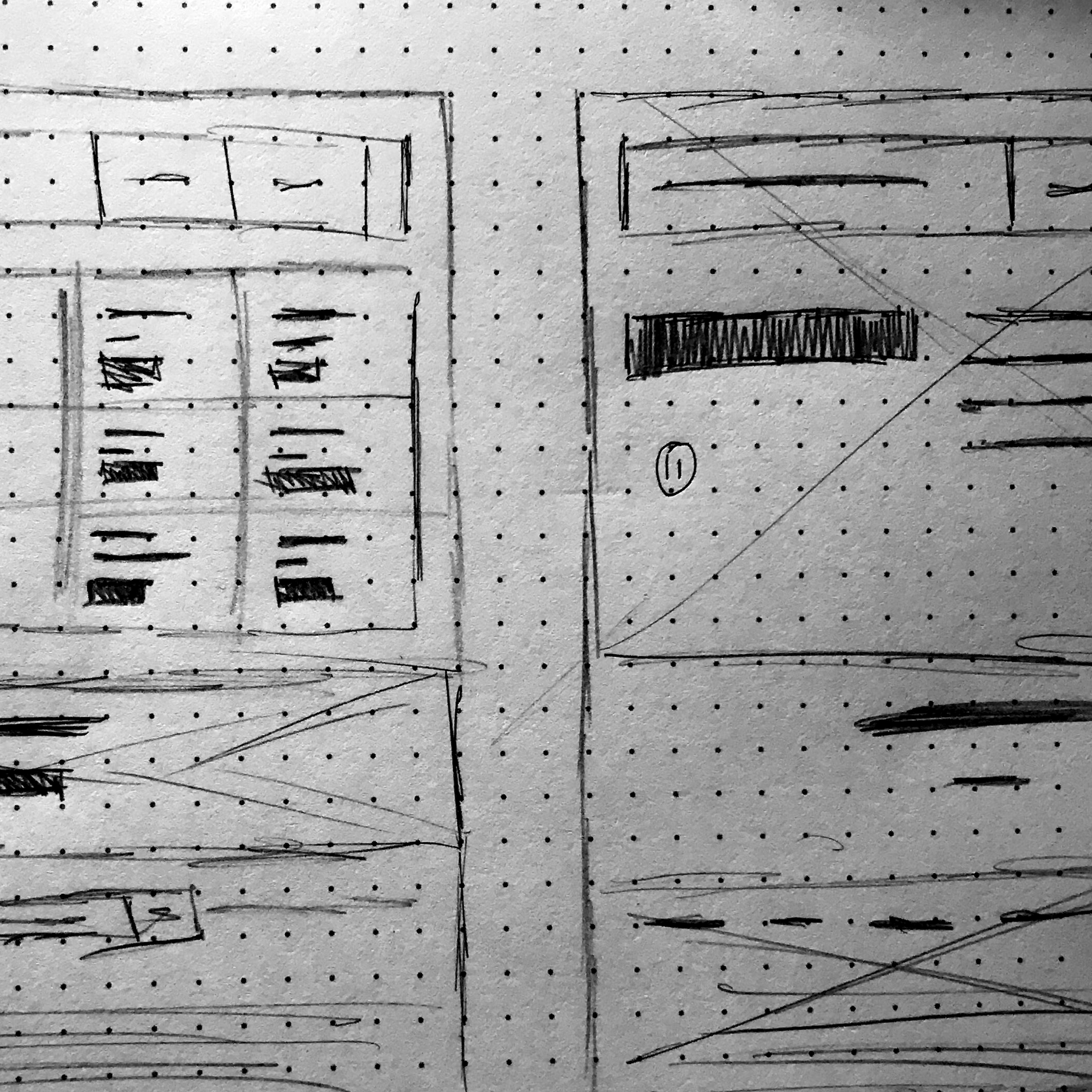
Wireframing was done primarily with sketches as the client wanted a simple site with little blemishes. The UX for the site was designed to always lead the user to the work as well as the ability to quickly hire them at the end of most pages, this was to give the user an easy way to quickly get in touch with the client.
The site’s UX was primarily built to showcase the prowess of Big Shooter Productions ability through work and energy the teams brings to the table. The UX focuses on the content and lets the user digest content fast and efficiently while always leading them along a simple story about the client. Each page has links to other sections of that correspond to the previous page, this allows the user to always be jumping into a multiple pages.

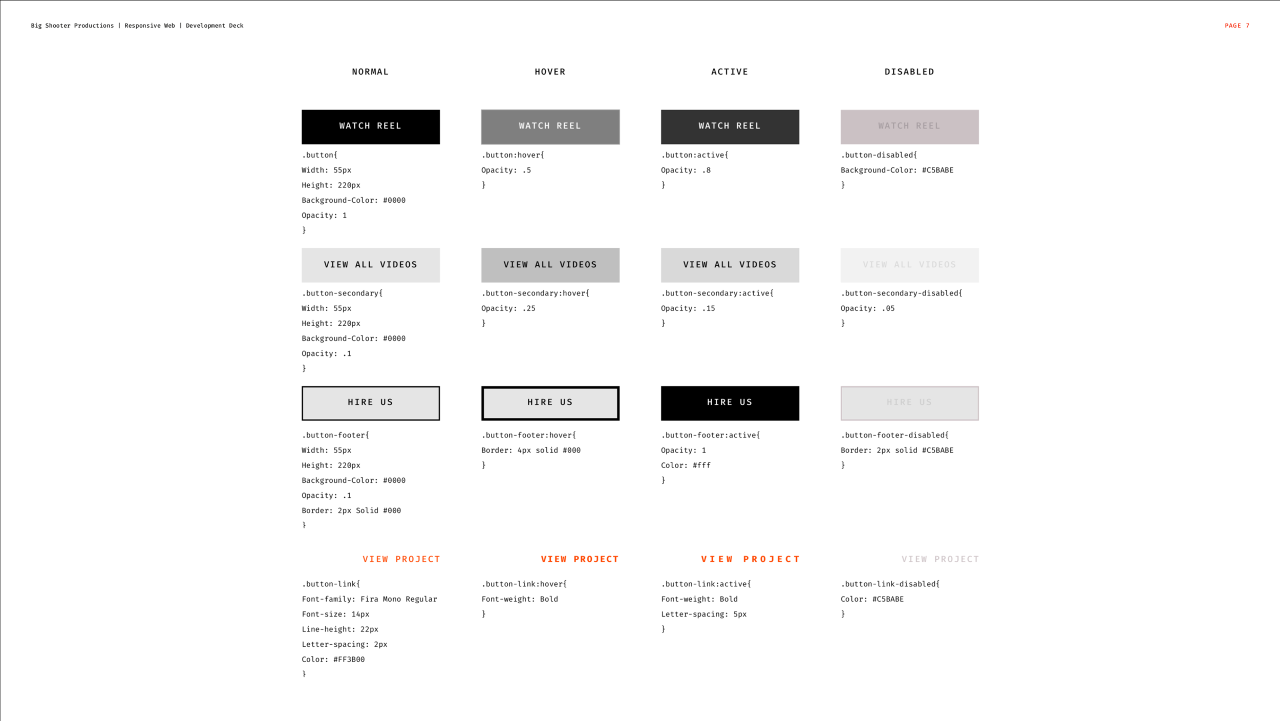
The User Interface
The UI for Big Shooter Productions was designed to represent “retro-future” this was a major ideology at the company. Using new film equipments with old film techniques is what defines Big Shooter Productions and the interface needed to represent that. The interface pulls from old sci-fi films such as 2001: A Space Odyssey to give the site a unique feel while still keeping the site fairly minimal and easy to navigate.


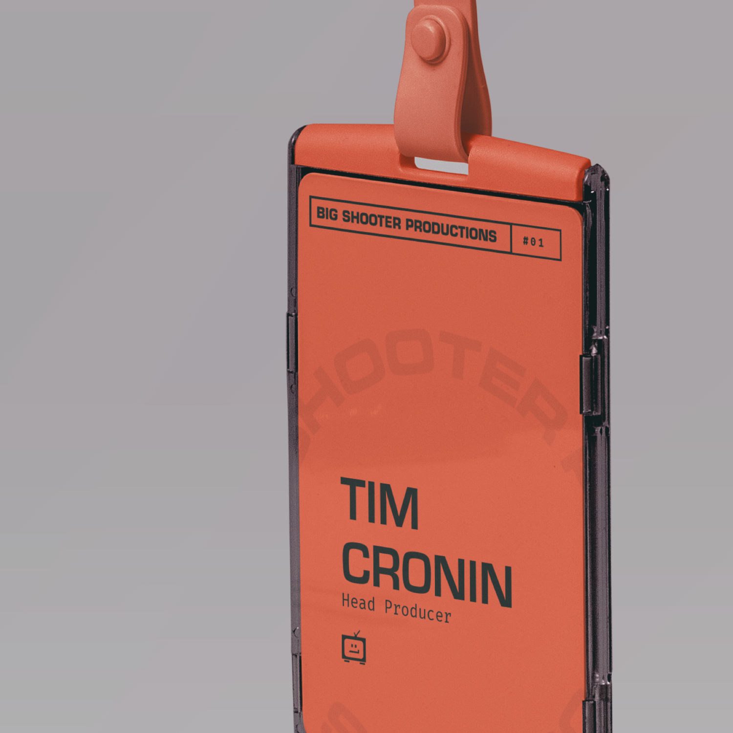
“Always went 120%, whenever I would expect the average I’d get the best!”
T I M C R O N I N The Takeaway
Working with Big Shooter Productions was a learning process. The client didn’t seem to understand the need of properly developing out the site. I provided tons of documentation for the developer he hired but wouldn’t let me directly work with the developer. As